


Unique,
High Performing,
Fully Responsive
Web Design Solutions.
Ensure your guests have a great experience across all devices.
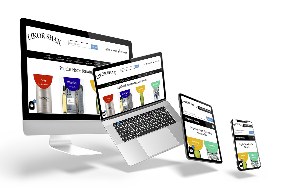
A responsive ecommerce website customized for our friends at Likor Shak, located at 115 Mcleod Avenue in Saskatoon.
All Our Web Design Plans Include:
- Customized designs specific to your brand
- Fully responsive from desktop, to tablet, to mobile
- Staging site provided to track progress of new build
- Migration of content from previous site if applicable
- Google Analytics to track all relevant site data when live
- Automated backups and plugin updates for optimal performance when live
Want a quote for your project?
Our clients at Magna Web Services work in a wide array of industries. As such, it is important that we build solutions that cater to the needs of each individual client. One of the most important aspects of the building process is ensuring the site design and functionality work seamlessly across all devices that a potential guest may use. This is known as responsive web design. A lack of responsive design has become a widely recurring issue noticed when viewing Saskatchewan business websites today, and one that should be eradicated as soon as possible to cater to the ever-growing use of mobile devices.
What exactly is web responsiveness?
Web responsiveness relates to the ability of a website to update the styling of its content on a page depending on the screen size the website is being viewed on. When going from viewing a website on a desktop to a smartphone your viewport becomes much smaller, and as such certain elements will need to be rearranged, re-styled, or removed for that viewport size in order to facilitate a smooth and cohesive viewing experience for the guest. Many sites are not still not mobile responsive because prior to the release of the first iPhone in June, 2007 there was little need to consider web design for smaller screen sizes. Since then mobile use for web browsing has grown exponentially and in today’s world responsive design has become an absolute necessity for any modern website.
How can I tell if I’m on a non-responsive website?
Chances are you won’t need us to tell you. It can be very hard to navigate a website that is not web responsive. In most cases the desktop version of a non-responsive website will look alright because that is the screen size it was made for. However, if you then try and view it on a tablet or smartphone you will begin to notice issues right away. Extremely small text, navigation links so close together you can’t click them, and having the entire page displayed on your initial viewport with no ability to scroll are all dead giveaways that the website is not mobile responsive.
Why is this so important?
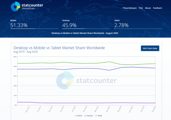
In the summer of 2015 Google reported that for the first time ever mobile searches had surpassed desktop searches. This disparity has continued to slowly grow over the past few years. This image from StatCounter.com shows the amount of searches per month on each device from September 2019 – August 2020. If your site is not mobile responsive in 2020 than you are not addressing roughly half of your potential audience that are viewing your site on tablets & mobile devices.